Logo Design
A logo design is your company’s front face to the universe! A logo should identify your company and make your brand unique. It is the first impression your clients and customers get of your business.
With affordable prices and specialising in beautiful logo design, Interaktiv Design should be your first choice for logo design Brisbane. Our mission is to create a brand identity for your business that is creative and impacts your potential clients in a memorable way.
Branding
Who are you? What is your business about? Branding is about defining these questions in your client’s mind. It is the basis for communicating the elements that constitute your company. Your mission, your products and your services are the starting point of any company branding.
A brand is the consistent theme that connects all these elements and ensures they are presented in a consistent manner. Often, branding is not something that just happens overnight. Successful branding requires thought and preparation in marketing as well as planning and attention to detail.
Interaktiv is a talented design house and have an ingrained understanding of branding. Your corporate identity is how you are set apart from your competitors. Branding can make or break your business. Let Interaktiv help you create the branding for your business today.
Logo Design Case Study
At Interaktiv, we often get asked the question:
"Can you make my logo bigger?"
It’s often the first thing mentioned by a client when commenting on a new website design. This seemingly small change seems simple enough to rectify, but the reasons behind the client requesting such a change, and the frequency of such requests often cause problems.
The Reasoning...
Clients often put a lot of weight in their logo. You may see your logo as a representation of the hard work and success of your business. You might see it as your brand and the heart of your business. Therefore wherever possible you should display it as prominently as possible. Unfortunately, while these things do matter, perhaps take a step back and look at the whole picture before jumping to conclusions.
Why would changing the logo size be such a bad thing?
A website is built for one specific purpose. It will either sell products, generate revenue or advertise your business services in order to generate a revenue. Anything that doesn’t serve this purpose should not be on the page, or should melt into the background. The site logo is one of these things.
Over emphasis of the logo is essentially turning the website into a digital photo frame with the logo attracting far too much of the user’s attention. Making the logo bigger often unbalances the look of a web page. At an increased size, it takes more of the available space on the page and leaves less for any information designed to sell your product.
A website is often designed around the logo. It’s the first thing placed on the page and creates the designer’s palette for the rest of the site. Changing or resizing the site’s logo may disrupt the layout of the site and make it appear out of place.
At times, it can only be a few pixels different, but it can equate to a lot more as to the user they’ll see multiple items fighting for their attention rather than a single primary call to action.
Some Examples

Nike
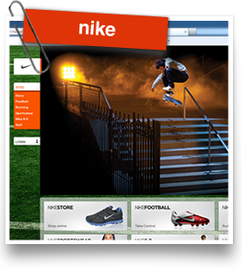
It’s well known that Nike has some of the best branding in the world. From the instantly recognisable logo to the unique styles and imagery in their branding, Nike is an excellent example of logo design and branding.
Upon visiting the Nike website you’re instantly greeted with the logo and a fantastic product placement photo. Note the size of the Nike logo in relation to the other elements of the website.

Amazon
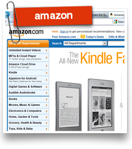
Amazon is one of the biggest online retail stores in the world. Their website is clean and functional. The purpose of their website is to entice you to view their products and make a purchase.
When you visit the Amazon home page you immediately recognise what site you’re on and they hit you with their feature product. The logo is placed neatly in the site’s header in the top left corner and is quite small.

Australia Post
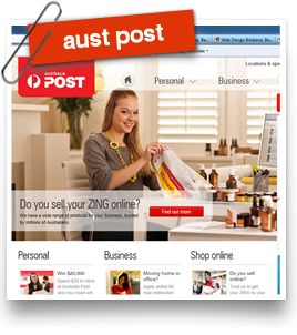
The service based company Australia Post has a simple to use website. Large imagery shows their services on the home page.
The website gives the impression you will be treated the right way as a business or customer. The logo is simple and easily recognisable in the top left corner. It is not meant to distract the customer from the main message. Also of note is the change of logo size for content pages of the site. It becomes smaller and blends with the page header.
Conclusion
Rather than increasing the logo size to attempt to push the branding of the company, the logo should be balanced in the design and become an element the user quickly glances at to confirm they are at the correct website. A simple logo with standard positioning at the top left or top center of the page should be enough to let users know what site they are visiting. Consistent templates and site layout will also help to keep the client feeling like they’re at the page they meant to be on.
The logo will never be a factor in gaining a sale or enquiry. A larger logo will only distract the user from their goals and reduce the space available for the rest of the website to sell your product.
